Sharpie
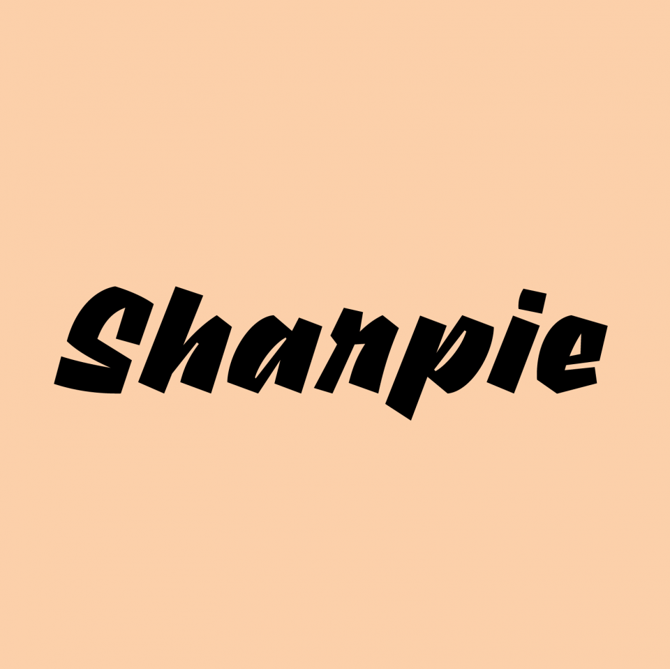
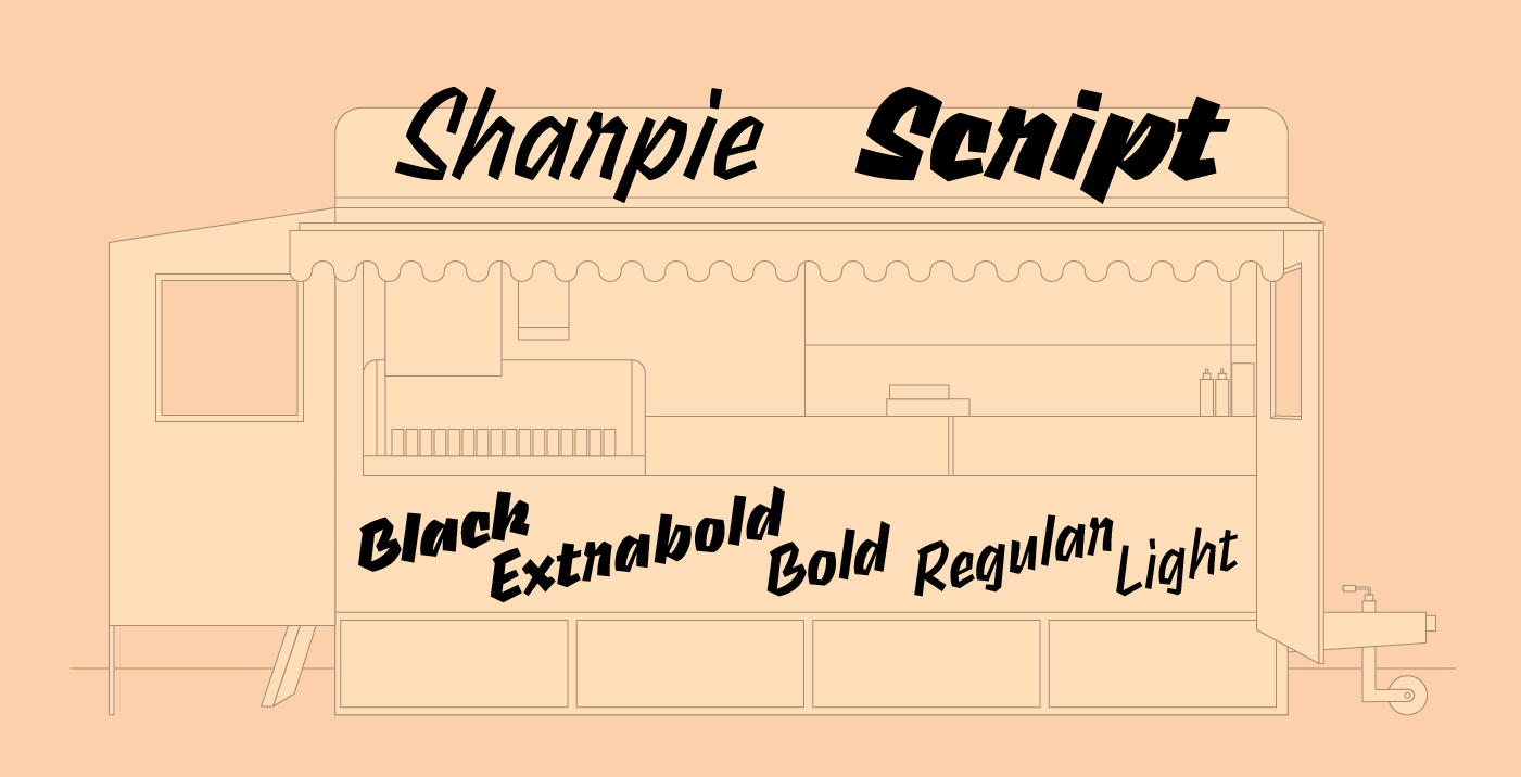
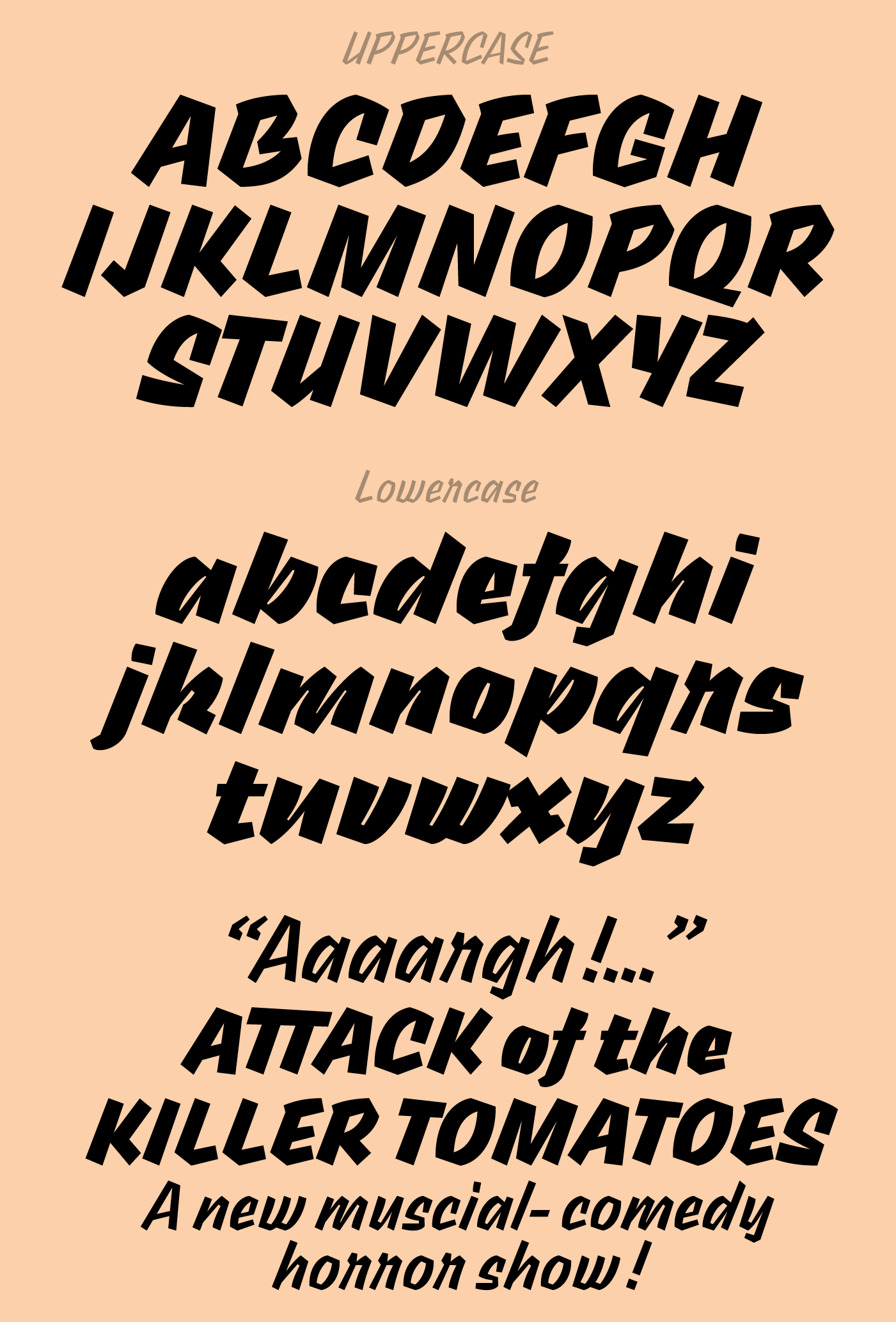
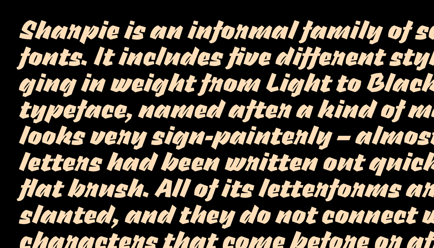
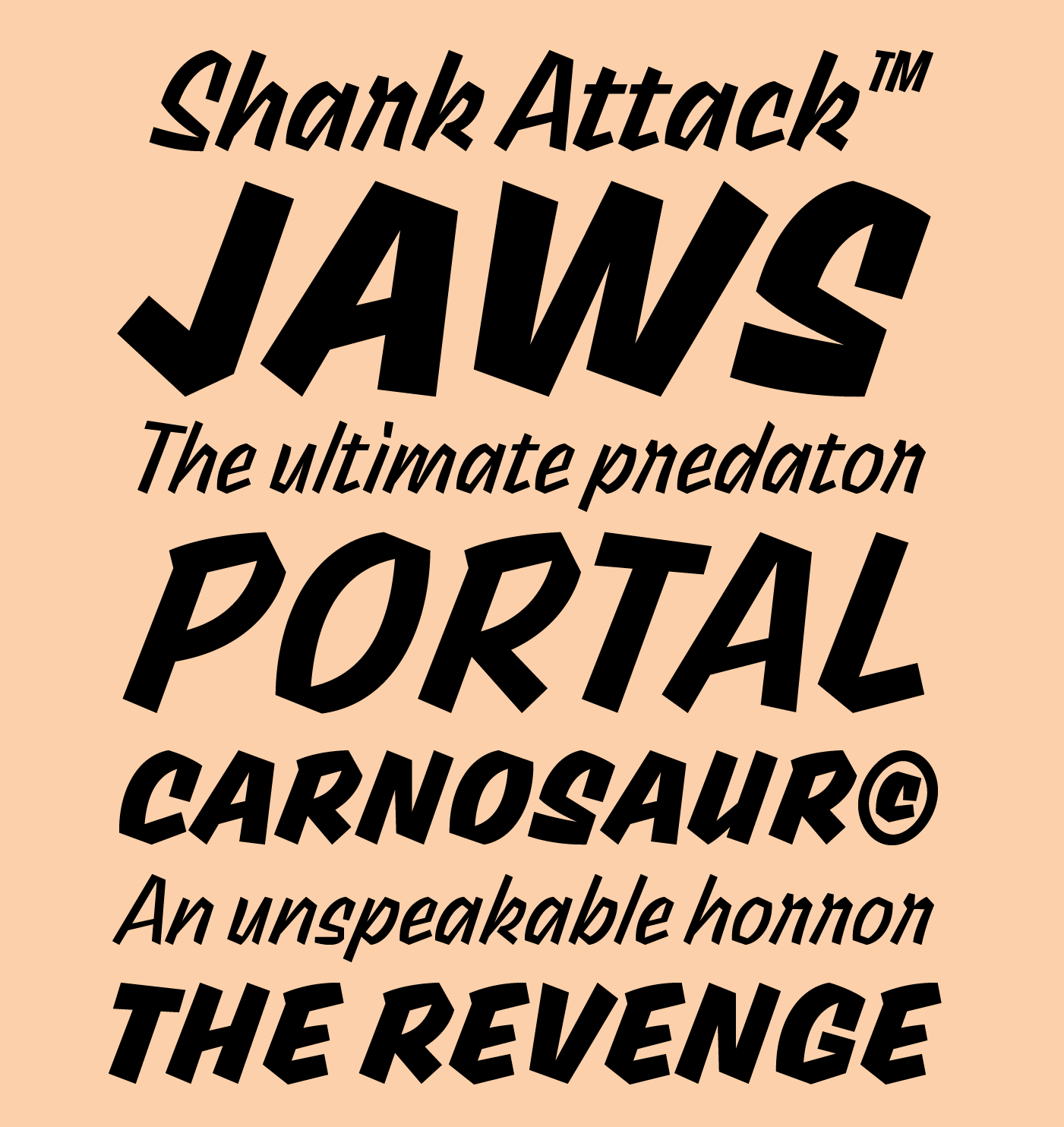
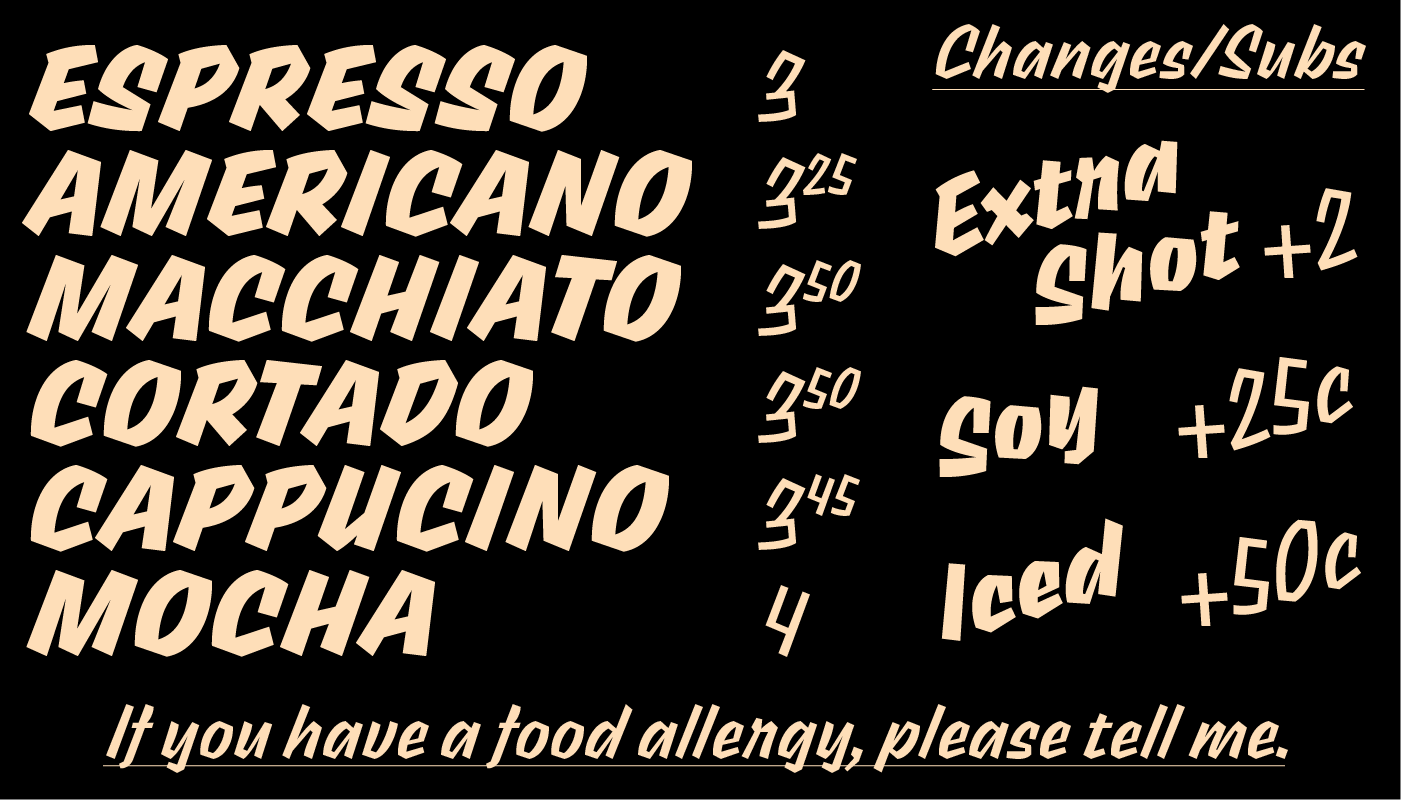
Sharpie is an informal family of script fonts. It includes five different styles, ranging in weight from Light to Black. The typeface, named after a kind of marker, looks very sign-painterly – almost as if its letters had been written out quickly with a flat brush. All of its letterforms are slanted, and they do not connect with the characters that come before or after them. Sharpie’s strokes are very angular in their appearance. The stroke-contrast is rather modest in the Light weight, but by the Black, it is very strong (really quite awesomely so). Sharpie’s lowercase letters don’t have a very tall x-height. The tops of the ascending-lowercase letters, the capitals, and the numerals all rise to about the same point. The ‘a’ and the ‘g’ in Sharpie are both single-storey in their forms.
Available at : fontstore.com
