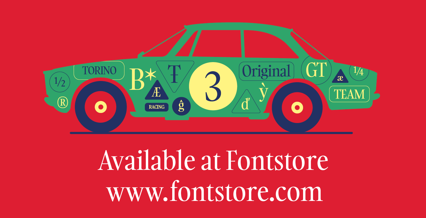
Gambarino
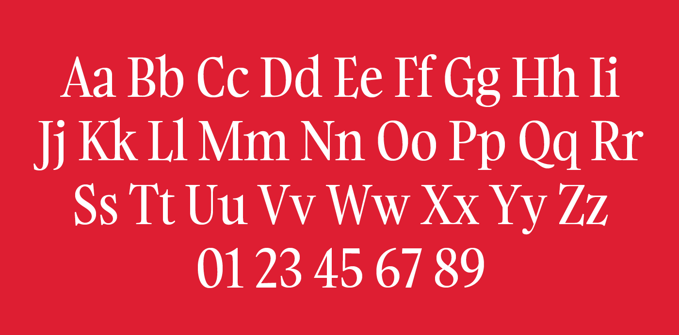
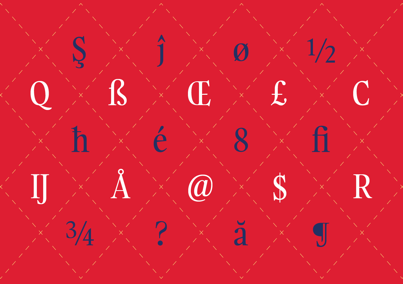
Gambarino is a condensed, single-weight serif face for headlines. The font is designed by Théo Guillard. Stylistically, you could call it a post-modern interpretation of the Garalde genre. Gambarino is different enough from most serif typefaces designed for text that you could combine it with another Garalde easily; that other font would set the body text, while Gambarino would shine in the headlines. Gambarino’s serifs are exquisitely fine; they are paired with teardrop terminals, such as on the ‘a’, ‘f’, and ‘y’. The capital letters are top-heavy; the bowls and counterforms in the upper portions of each letter are larger than the lower ones. This is visible, especially, in the letters ‘B’, ‘E’, ‘F’, ‘P’, and ‘R’. The trait is not quite carried on into the lowercase, but the design of the ‘a’ really harmonises with these unique capital letters anyway. Gambarino’s lowercase features a tall x-height, and what can only be described as ‘microscopic’ descenders. The descenders are all much shorter than the font’s ascenders, and this is visible everywhere except in the ‘g’, which employs a great trick in its design to keep the sizes of its two bowls balanced.
Available at : fontstore.com